[ Client Work ]
Bold new branding connects survivors of violent crime with support

Services
- Creative Strategy
- Branding Design
- Print Collateral
- Digital Design
The ROAR Center provides survivors of violent crime in Baltimore City, MD with a full range of free legal, social, medical and mental health services from a single location. By treating survivors with dignity and respect, regardless of their role in the crime or criminal history, ROAR works to heal the trauma that causes repeat violence and creates alternatives to aggressive policing and incarceration.
As a program of the University of Maryland, ROAR previously was using a standard logo and branding supplied by the University. Community feedback showed the brand was essentially invisible to their target audience and not reaching the people who need it most, resulting in survivors going without important services and the life-changing support they deserve.

Our Solution
Working closely with ROAR staff and stakeholders, we completed a detailed strategic process to understand the personality and character of the center, community context, the nuances of their audiences and what their brand needs to achieve. We developed a suite of moodboards to hone in on the visual tone that fits where The ROAR Center wants to go.
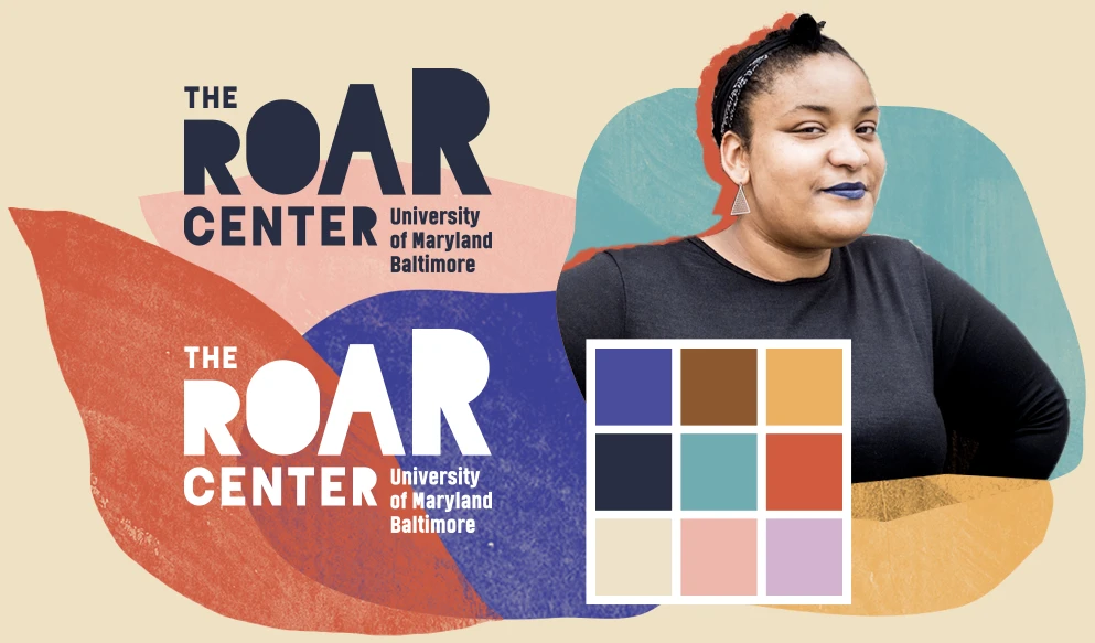
We then created a boldly approachable and artistic brand that uses color, brush textures, non-traditional accent fonts and realistic portraits to communicate forward movement, realistic yet upbeat energy, layered pieces coming together and a strong, reassuring “we get you / we’re here with you” vibe. As a community-centered organization intentionally focused on serving people of color and other marginalized groups, it’s important for this brand to catch the eye of these audiences and feel engaging to them.
The ascending letterform shapes in the logo reflect ROAR’s focus on growth and the origin of its acronym, “Rebuild, Overcome and Rise.” The colorful textures combine into layered organic shapes that interact with the portraits and frame content.
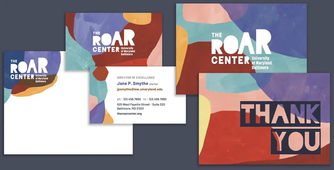
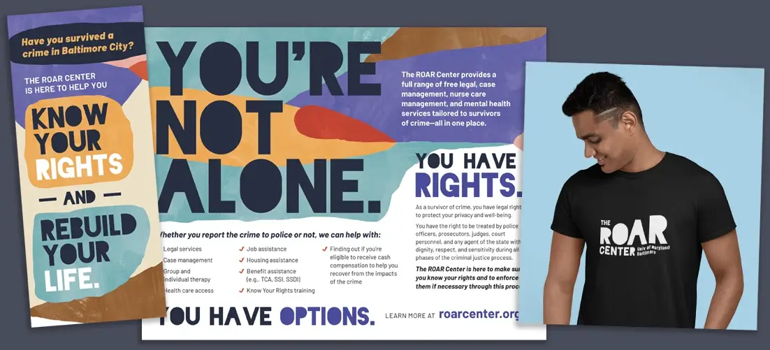
We’ve begun building out the brand application through stationery and a variety of print and digital collateral including flyers, brochures, postcards, t-shirts, PowerPoint templates, posters, event materials and more.
As a separate project, we planned and built a brand new website for The ROAR Center. See what we did in our case study here, and the live website at roarcenter.org.


