[ Client Work ]
The Pivot Fund steps forward with fresh new branding

Services
- Creative Strategy
- Branding Design
- Print Collateral
- Digital Design
The Pivot Fund is working to channel $500 million to hyperlocal, digital news outlets serving marginalized communities. In addition to supporting its local newsroom grantees, The Pivot Fund helps major funders identify and invest in hyperlocal news outlets that have the trust of their communities. Together, they’re building a more inclusive future for local news that strengthens our democracy from the ground up.
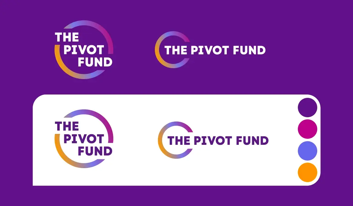
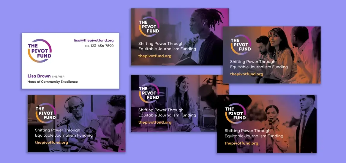
After its first few years in operation, The Pivot Fund had outgrown its starter branding. We were delighted to work together to refresh and expand their branding into a dynamic, cohesive system that more accurately represents their professional personality. Their new brand system builds credibility with the logo in both circular and horizontal formats as well as a complete system of color, typography, abstract shapes, photo treatments and other design elements.

Our Solution
Even though we had already been working with The Pivot Fund for over a year at that point, we started our rebrand process with a thorough strategic review. This included factors such as theory of change, goals, challenges, external context, internal personality and others. We explored different possibilities for their new visual voice, developing moodboards to help solidify our thinking around visual tone.
Visually speaking, the new Pivot Fund brand needed to communicate modern professionalism to build trust with funders. It also needed to feel alive and colorful to reflect Pivot Fund’s unique ability to understand grantees in underserved communities across a spectrum of race, ethnicity and culture. This brand needed to engage two primary audiences at once, inspiring confidence and feeling relatable to both large institutional funders and grassroots newsroom grantees.
The Pivot Fund’s original logo used a round brush stroke encircling their name. We redesigned this approach to include a circular color gradient shape that energetically interacts with their name. We intentionally selected a geometric font whose round letterforms reinforce the circular theme. The gradient is meant to symbolize graceful interaction and intersectionality between different cultures. We use gradients throughout the brand system, applying it to solid areas, images and design elements.
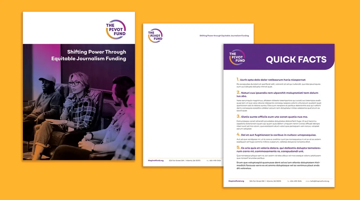
We’ve begun building out the brand application through stationery and a variety of print and digital collateral including a custom pocket folder, reports, PowerPoint templates and more.
As a separate project, we planned and designed The Pivot Fund’s first impact report. See what we did in our impact report case study.


